All work

NAB · ATM · 2026

Elevating NAB’s ATM experience

Bringing NAB’s ATM interface in-house and adapting the design system for cash deposits, withdrawals, and everyday banking.
Role
Product Designer
Team
ATM Refresh
Year
2026

Designing for a physical machine

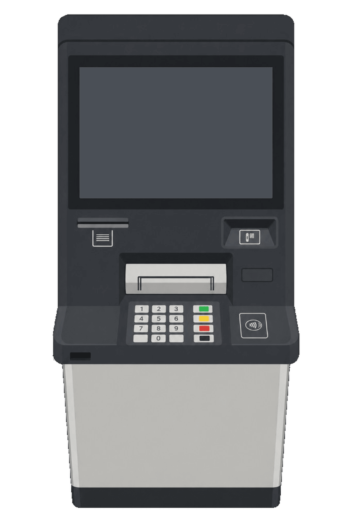
ATMs don’t work like mobile apps. I tested real machines to see how people move between the screen, keypad, card reader, and cash slot. Display height, physical controls, viewing distance, and lighting shaped every design choice.

Someone standing at a physical ATM in the NAB testing lab
An older version of the hardware.
Team standing in front of The Lab at NAB in Melbourne
NAB lab, Melbourne.

Adapting the design system

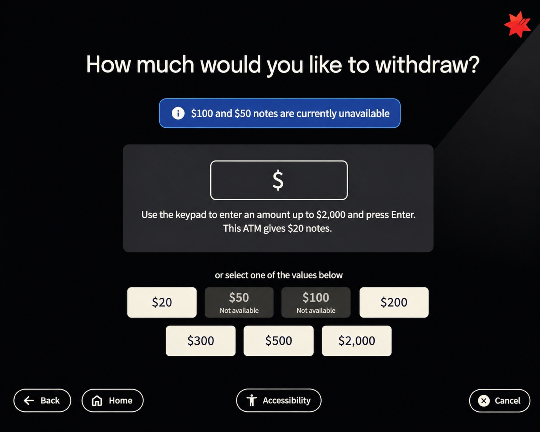
NAB’s web and mobile design rules didn’t translate to a large ATM screen. We adjusted typography, touch targets, and control placement so everything was easy to read and tap from a standing distance.

ATM withdraw cash screen adapted from the design system with large touch targets and keypad guidance
Components adapted for ATM.

What customer testing changed

We tested 5 core journeys with 12 customers in our Melbourne lab and fixed two key friction points:

Missing memo confirmation

Customers weren’t sure whether their deposit note had been captured. We added a review step so they could confirm it before submitting.
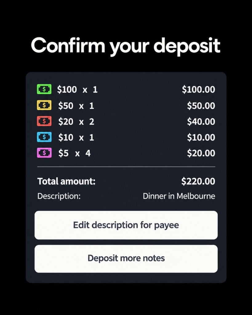
ATM confirm deposit screen showing note denominations, total, and description Dinner in Melbourne
Added review step

Transfer flow clarity

The existing transfer summary was hard to scan. We separated the source and destination accounts, made the amount more prominent, and added clearer directional cues.

Before
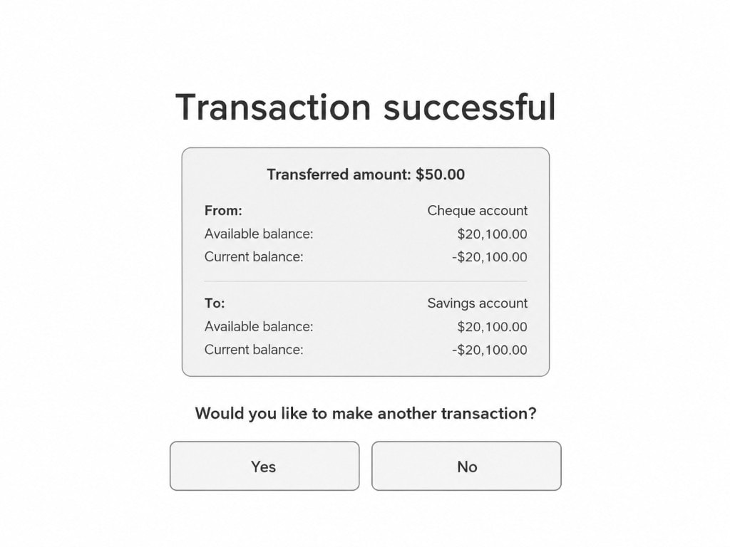
Original ATM transfer success summary with stacked list layout

After

Redesigned ATM transfer success summary with clearer amount and from-to grouping

Transfer summary, before and after.

Ergonomics and reachability

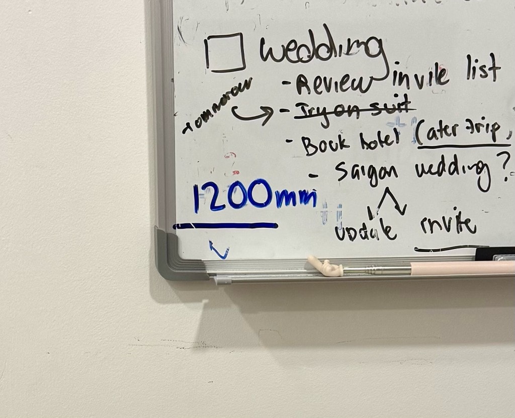
Accessibility on an ATM is physical. I marked a 1,200 mm line on my whiteboard, the standard reach limit for wheelchair users, to keep the team focused on who we were designing for. We kept all primary buttons below that height so they stayed within comfortable reach.

Whiteboard with a blue 1200mm reach-height line marked for wheelchair accessibility
1,200 mm reach line on my whiteboard, sandwiched between wedding prep.

Viewing conditions and glare

ATMs sit in unpredictable lighting, from direct sunlight to dark corners. We created light and dark modes and tested them on real displays to catch glare that Figma couldn’t show.

PIN entry screen in light mode on a physical NAB ATM
PIN entry screen in dark mode on a physical NAB ATM

Light vs. dark mode on the real machine, showing how dark screens pick up overhead lighting.

Prototyping beyond Figma

Static Figma frames couldn’t capture the real-time interaction flow we needed to prove out. I built a working code prototype to demo live withdrawal and deposit flows to bank managers over screenshare. Showing real software behavior made the experience tangible, giving stakeholders confidence in the direction before production engineering began.

Video call showing an ATM prototype demo with Tan and colleagues
Prototype demo with bank managers and the project team.

Testing on actual hardware

Putting the design on real hardware changed how everything felt. It let us evaluate the full flow, from on-screen prompts to hardware actions, in context.
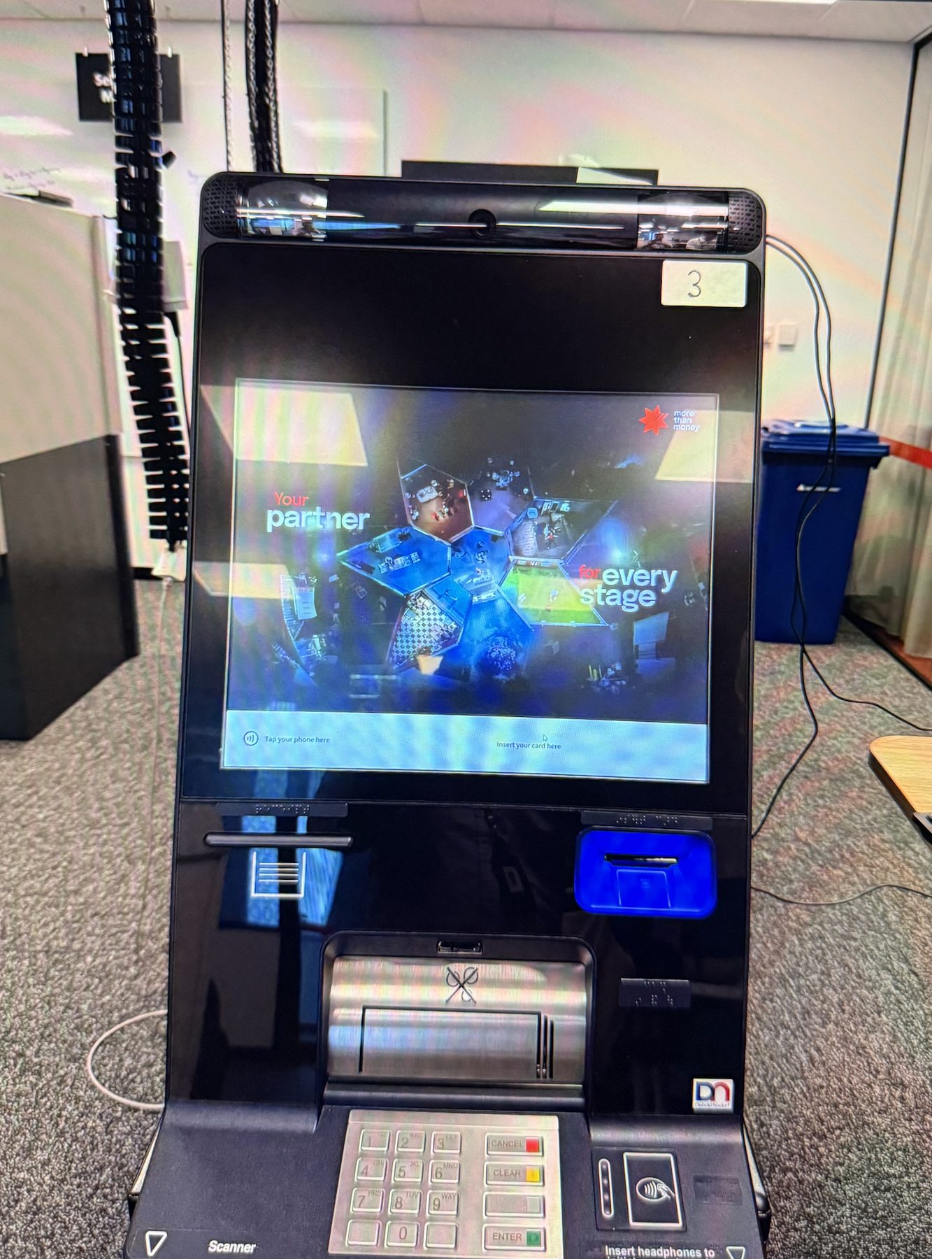
Close-up of ATM hardware with screen glare from overhead lighting
Testing on the physical ATM.

Syncing the screen with the hardware

Depositing cash needs tight coordination between the screen and the machine. I worked with an agency to time animations with physical cues, like lighting the cash tray, so each signal guided the customer to the next step.

Card tray lighting as a hardware cue.

From individual screens to complete journeys

We brought core tasks like withdrawals, balance checks, and transfers under one interaction model. Once customers learned one step, the rest felt familiar.

ATM home screen in dark mode running on physical NAB hardware
Home screen on the physical ATM.

10

Validating the experience before pilot

Tests across five core journeys with 12 customers validated our interaction patterns and met 100% of our accessibility goals. The work also left a reusable foundation for future ATM features.

5Core journeys tested

12Customers across usability testing

100%Accessibility requirements met across tested flows

11

What I took forward

The biggest lesson was designing for the physical environment, not just a screen. Distance, lighting, reach, and hardware all change how people use the machine. Testing on real hardware early saved us from expensive changes later.